to purchase this print please click here
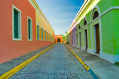
I converted this image from a CRW file format as a 16-bit ProPhoto RGB image using the Adobe Photoshop Camera Raw. Then I saved it as a PSD file and resaved as a copy after a conversion to AdobeRGB using the Adobe ACE with relative colormetric and a black point compensation.
After opening both 16-bit files inside the ProPhotoRGB color space and pasting the AdobeRGB tagged file as a layer into the ProPhotoRGB tagged image I switched a blending mode of the pasted layer to the Difference mode, thus getting the following image.

After opening both 16-bit files inside the ProPhotoRGB color space and pasting the AdobeRGB tagged file as a layer into the ProPhotoRGB tagged image I switched a blending mode of the pasted layer to the Difference mode, thus getting the following image.
click to see a Flickr! of this image
It is granted that the original image does not represent an ideal test subject as it can't contain all of the colors involved. It is, however a real world image, and it does show the actuall application implication of using different profiles when converting RAW images and chosing a workspace.
Now, about the real world application.
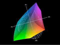
The ProPhotoRGB version of the image and AdobeRGB version of the image were both printed on the Canon i9900 printer, using a custom profile for the paper built with the Eye-One Match 3 from GretagMacbeth hardware and software solution. This is how the custom printer/paper combination profile compares to the AdobeRGB colorspace.
Now, about the real world application.
The ProPhotoRGB version of the image and AdobeRGB version of the image were both printed on the Canon i9900 printer, using a custom profile for the paper built with the Eye-One Match 3 from GretagMacbeth hardware and software solution. This is how the custom printer/paper combination profile compares to the AdobeRGB colorspace.
Shaded shape is AdobeRGB, mesh is a printer profile.
As you can see many of the colors fall out of the range of the AdobeRGB color space. Yet all of this colors are contained within the ProPhotoRGB as it is a much larger color space.
After letting the prints dry I have evaluated them visually under the 5000K light and under the available daylight. The prints were very similar, but the ProPhotoRGB print had slightly "punchier" orange in the color of the building. The AdobeRGB print had more magenta in it and was further from the image rendition on the calibrated CRT screen then the ProPhotoRGB print.
After letting the prints dry I have evaluated them visually under the 5000K light and under the available daylight. The prints were very similar, but the ProPhotoRGB print had slightly "punchier" orange in the color of the building. The AdobeRGB print had more magenta in it and was further from the image rendition on the calibrated CRT screen then the ProPhotoRGB print.
Interestingly enough, when both versions were viewed on the screen there was virtually no difference in the color appearance. This is probably due to the limited capabilities of the CRT color reproduction.
As an added bonus I have printed an 8-bit image version but could not see a quality difference from the 16-bit version with a naked eye. This, however, might be due to the nature of the image subject. When using the difference blending mode procedure described above as well as boost in saturation and brightness of the resulting image the minor difference was descovered. Here is the map of it.

As an added bonus I have printed an 8-bit image version but could not see a quality difference from the 16-bit version with a naked eye. This, however, might be due to the nature of the image subject. When using the difference blending mode procedure described above as well as boost in saturation and brightness of the resulting image the minor difference was descovered. Here is the map of it.
please, click for a Flickr! of the image
So, here you have it. There is an undeniable destinction in theory, that, while having a practical realization, not absolutely critical as far as ink-jet printer concerned. Also, color space proved to be more affecting the final output then the 8-bit versus 16-bit difference.
I will follow up with the instrumental measurment analysis of the different prints of the test image in the near future.


No comments:
Post a Comment